
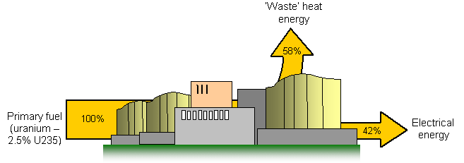
These diagrams are a way of looking at the input and output of energy for a power station – or indeed any type of machine.
They show the input energy and then the percentages of this that are useful output energy and 'wasted' heat energy.
The example is of a typical nuclear fission power station where only 42% of the input energy is finally converted to electrical energy.